List
Type
UI Design Case Study
Role
UX/UI Designer
Duration
3 Months
Tools
Figma

Realistically, what is this about?
Real estate investment is an increasingly popular way for individuals to achieve financial security. It is an exciting and emotional experience, but often complicated. While there are plenty of blogs and agencies providing information, often, buyers new to the market may struggle to get started without professional guidance and waste time viewing properties out of their range.
How can we provide potential home buyers information about relevant properties, and ways to curate those results to only those they would be interested in given their real estate goals, needs, and wants?
List is a responsive web app designed for the busy yet thoughtful homebuyer, making it easier for them to find exactly what they’re looking for in a more timely and efficient manner.

What design process was followed?
I chose to follow the Design Thinking Process for List. I have found that continuous iteration throughout the design process allows the best results to come forth through trial and error. Through continuous improvement, iterations, and design critiques, this design process enabled me to create the best possible design solution for List that not only looked visually appealing, but would help its users accomplish their goals.
Our Persona
The primary persona for List would represent the many homebuyers that already struggle with the same concepts when looking for a home: providing financial security for their families while making a big purchase they know they’ll be happy with, since a real estate transaction is one of the most stressful transactions a person conducts in his or her life.
Rashida represents this exact type of user. She was kept in mind during the entire design process, so List can help make it as easy for the user to complete such a major transaction as possible.

Establishing Flows & Putting it together
Knowing exactly who I’ll be designing for as well as exactly what they’re going to need from List, I went ahead and established some key features that each user would need to accomplish their goals:
1
An easy way to create a profile that contains all the users' ideal property criteria, so they are recommended results that are most relevant to them.
2
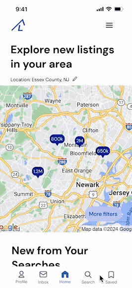
A way to search and filter properties so users can find good matches based on their needs.
3
Access to as much written and visual information about each property as possible, so the user can make an informed decision.
4
A way to save and mark properties the user is interested in, so they can easily revisit them.
5
The ability to contact a real estate professional if the user is interested in a property, so they can schedule a viewing.
Iterating & Refining the Design
After thinking through how Rashida will be navigating through the app, I then created low and mid-fidelity wireframes to establish the primary visuals that would help Rashida achieve her goals. Creating the mid-fidelity wireframes was the perfect time to start establishing spacing rules and visual hierarchy so all of Rashida’s tasks could be completed efficiently, and without confusion.


The overall feel...
I chose this mood board because of its simplistic feel, but also because it is different and has a more exciting color scheme compared to other real estate apps on the market, which should help Rashida achieve her goals.
I wanted the UI elements to be mostly rounded to maintain feelings of friendliness and approachability. As a contrast, I also wanted to introduce angles and interesting geometric aspects to the UI, so as to maintain visual interest while navigating the app.

...With the help of some color

It is clear that there is a need for a real estate app that users can not only trust, but that also makes the experience exciting instead of overwhelming. By choosing blue as the primary color, it helps establish reliability and trust among users, while also maintaining a calm environment as they’re navigating the app. By introducing peach, that will not only bring more excitement and playfulness into the app, but will also draw the users’ eye to key pieces of information and calls to action.
Since this app will be used in the midst of a major purchase, and therefore a significant period of stress, I wanted users to feel a sense of calm yet excitement on all screens through the use of this color scheme.
Having worked in the real estate industry, I know that there are far too many apps that place the emotional focus only on efficiency, professionalism, and security. Knowing that List’s goal is to make home hunting not only easy, but exciting, I wanted to go with a more whimsical, energetic, and somewhat lighthearted feel, while still retaining the air of professionalism that is necessary within a real estate app.
Taking a mobile-first approach allowed me to establish what content is absolutely necessary to include in smaller breakpoints, which would later require several iterations for both the desktop and tablet screens to come up with a design solution that would meet Rashida’s goals.

Mobile-first, with Different Breakpoints
Key Takeaways
Continuous, iterative design is everything. The process is just as important as the final result, if not more so, since each iteration helps get to know your users better as you try to think of design solutions that would best fit their needs, and also appeal to them visually.
Every element plays into each other, so it’s incredibly important to design holistically, while also keeping the needs of the user at the forefront.
User Experience and User Interface go hand-in-hand, and one cannot exist without the other, as the experience drives the interface, and the interface helps enhance the experience.
What happens next? More designing, of course! List is not finished, and I am excited to continue designing additional flows for how Rashida would contact a listing agent, schedule an appointment to view a property, and edit her personal preferences to find the properties she’s most interested in.
I might need to enlist some help... who knows? :)
In case you're curious, take a look at the working prototype here!


