Evergreen
Type
End-to-End Project
Role
UX/UI Designer
Duration
7 Months
Tools
Figma
Miro
UsabilityHub
Google Forms

How did this idea take root?
We all know those people who really love plants, and who can make some of the most seemingly difficult plants thrive without a second thought. However, all of these plant enthusiasts needed help at some point. With more and more people wanting to delve into the realm of creating their own indoor jungles, they all reach a standstill at some point. There's just so much information out there - what do they do when they need help from a like minded plant enthusiast, but there's no one around for them to talk to?
How can we give people access to avid house plant lovers like themselves, who have more knowledge than they do, so they can learn from them about how to better take care of the plants they love so much already?
Understanding the Problem
Taking care of house plants has turned into a deeply therapeutic and personal practice for many involved, so I knew this project required an incredibly human-centered approach. Therefore, through surveys and interviews, I knew I needed to figure out:
-
People's relationship with their plants
-
How people like to take care of their plants
-
What their goals for their plants are
-
How people learn how to take care of their plants
-
Challenges people have when taking care of plants
-
Most important aspects when asking others for help with their plants
-
How people like to ask for help, as well as when
Gathering Insights


However, I discovered extremely important, extremely human aspects that I hadn't considered at first:
The primary motivation for users to keep taking care of their plants is happiness and wellbeing. Taking care of plants contribute to the users having productive and creative outlets in their lives.
Asking for help can put someone in a pretty vulnerable position. Making sure this product allowed users to feel comfortable and confident to ask for help would be tremendously important, as well as ensuring they would be able to receive quick, productive answers to any question they have about their plants.
When asking others for help, users need to ensure that it'll be empathetic and productive, as asking for help usually comes once the users has already exhausted all their personal options.
Based on this research, I identified 3 main features that Evergreen needed to have:
1
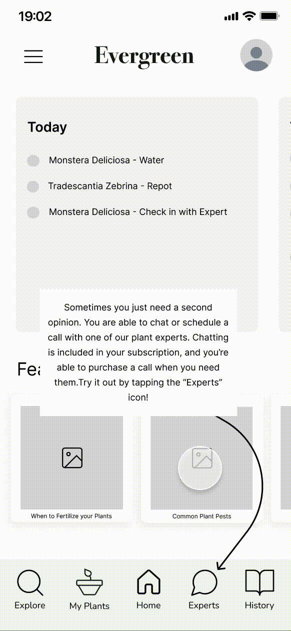
An easy way to talk to an expert, with options to choose an expert that will best fit the users' needs, a way to choose a communication method, and the ability to send photos.
2
A way to add and keep track of the users' new and existing house plants, and a way to track each plant's care tasks.
3
A seamless login and onboarding experience.
Our Personas
From this research, I was able to discern that there would most likley be two main audiences that will be using Evergreen.
James represents those who take care of plants as more of a side hobby, while Iris represents those who consider plants to be a passion of theirs and dedicate much more time to them than most.


Despite having different relationships with their plants, James and Iris both have more of an emotional connection to their plants and will greatly benefit from Evergreen's main features, as they will be built out with both of them primarily in mind.
Putting it together
Knowing exactly who the main personas would be, as well as what their priorities and pain points are, I worked through the user flows for the 3 main features identified, starting designing screens, and putting them together into a mid-fidelity prototype.

Testing & Iterating
Testing Evergreen's mid-fidelity prototype was done on people who fit the target audiences, through in-person and virtual testing sessions. 6 diverse participants between the ages of 29-62, with varying levels of passion for house plants, and with very different lifestyles tested the prototype by working through the key features previously identified.
The tests went perfectly, as there were several issues that were uncovered.
Issue 1
Users wanted to be able to see their most recently added plant at the top of their plant list, instead of at the bottom.
When adding a new plant to Evergreen, the users' newest plant would be hidden at the bottom of the plant list after being added. This led to some confusion.
Solution: The most recently added plant will display at the top of the user's plant list, instead of the bottom.


Issue 2
Users intuitively wanted to tap through the onboarding screens instead of swiping.
Tapping was the first way that users chose to navigate through the onboarding screens.
Solution: Introduce buttons to the onboarding screens, giving users the option to tap or swipe, and a clear option to skip.
Issue 3
Users did not notice additional times to choose from when booking a call with an expert.
Additional times to choose from when scheduling a video call were hidden, leading users to think there were only a few options to choose from.
Solution: Add page indicators below the expert time selection menu, giving users a visual clue that there are more time options.

Issue 4
Selecting a care topic when reaching out to an expert was sometimes missed.
Based on where the help topic selection dropdown menu was located, it was easily missed and sometimes skipped.
Solution: Add more visual emphasis to the care topic dropdown menu so the user doesn't glance over it.


A New Challenge
Developing the high-fidelity prototype brought some new challenges to light, as I realized that creating a high-fidelity design based on the existing mid-fidelity design would greatly compromise on some key features that the target audience would need.
Refining the Design
I wanted Evergreen to feel like a reliable friend that one would go to for advice. No-nonsense, and to the point, yet light, inviting and wise. Choosing the right shade of green made sense given the nature of the app, but I wanted to maintain the welcoming and intelligent environment the users would need, so I opted for a slightly more muted, less intense green compared to similar apps on the market. Making sure the color scheme was relaxing and soothing was imperative given that the users could be navigating the app during times of stress.
Nunito font is used throughout the app, maintaining the goals of simplicity and efficiency while also remaining friendly and readable. An approachable font reduces the vulnerability sometimes felt when reaching out for help.
Logos and icons were designed to further reinforce the friendly, approachable, and reliable nature of the app, and Evergreen was able to be brought to life:


Key Takeaways
So, what comes next? As we all know, a design is never really finished. Coming up with design solutions that will allow the user to achieve theri goals is the first step, but what comes next is what really differentiates a product from its competition and keeps users coming back.
One next step would be to design a rewards system to further incentivize users to keep using Evergreen. Additionally, adding fun elements to task completion items will bring the user small, unexpected instances of joy. For example, cute and delightful animations and haptics when users complete all their tasks for the day, or easter eggs being presented to them as they're navigating the app to motivate them to use the app more than they already are.
Evergreen is not finished - but boy, has it been fun to make this idea bloom.
In case you're curious, take a look at the working prototype here!